Tag Archive for: social media

Quick overview of Facebook Multi-Product Ads

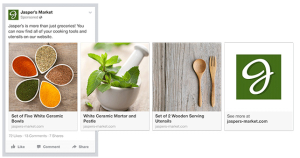
Quick overview of Facebook Multi-Product AdsLately, you may have noticed multi-product ads on Facebook. They feature multiple images, each with its own linkable URL. Apparently they are seeing higher than normal results for less than normal cost. And they look pretty good too!


If you’re a small business owner, you should really pay attention. Facebook multi-product ads seems especially well-suited to retail shops (you could feature images of your most recent / best-selling items), restaurants, coffee shops, and service providers like salons, and photographers. Remember, each image links to its own page, so it is a chance to showcase different sections of your website. And you only pay for one ad,  even though there’s multiple images and links.Facebook Multi Product Ad

This is one of the newest and biggest things on Facebook at the moment, and I recommend jumping on board before everyone else does.

It took me a while to figure out how to make these, but I finally found a very simple, step-by-step set of instructions on the Facebook page. You can view the info here: https://www.facebook.com/help/382681505244772

Note that in order to take advantage of this new type of ad, you need to be using Facebook’s Power Editor. And you can only use Power Editor through the Google Chrome website browser. But it is amazing. Check it out!

Need some help? Please send me a message or leave a comment. Happy Facebooking!

LinkedIn icon

LinkedIn iconToo often, as I am browsing through LinkedIn to find new connections, I see people I know but I hesitate when it comes to adding them as contacts. Why? Because their LinkedIn profile is so lacking that I feel like adding them would be a waste of time.

If you have a LinkedIn profile, you should at least complete the following info:

  • A profile picture. I mean, does this picture actually make you want to connect with someone?LinkedIn profile default picture
  • Your full first and last name. I understand the desire for privacy but chances are there is already lots of information about you out there on the internet (related: have you done a Google search of your full name lately?). LinkedIn is a professional social media site, and if you are going to be on it, you should use your full name so that people know who they are connecting with.
  • A list of your work experience. Seeing a profile that just lists one current occupation looks empty and incomplete. Take some time to list other positions you have held over the years.
  • Check in occasionally to accept invitations to connect, and to browse and add other people who you may know. If you only have 10 connections, it doesn’t look like you’ve made much of an effort.

For bonus points, consider adding these extras to your LinkedIn profile:

  • Your city and province / state. There are some instances where you may want your profile to say only the province or state (such as a real estate agent who wants to serve a broad area) but the majority of the time, it will help you connect with others if you are specific with your geographic area.
  • Descriptions of past jobs. Add some information about positions you’ve held and, if applicable, add a link to the companies’ LinkedIn profiles.
  • A summary. This section is the first major portion of your LinkedIn profile that people see, and it gives you a chance to express yourself however you like. You can talk about your accomplishments, skills, clarify your business offerings – it’s up to you. And if you’re stuck, look up other people’s profiles on LinkedIn for some inspiration.

Are you on LinkedIn? I invite you to connect with me at http://www.linkedin.com/in/jenhames

When I first started on Twitter back in 2008, I viewed all Tweets within the Twitter interface. Then, I got hooked on HootSuite, especially when I started managing multiple Twitter accounts. I’m still a paying subscriber to HootSuite and love using the cute little Hootlet add-on to easily share interesting URL’s on Twitter. But something just seemed to be missing.

Enter TweetDeck. This slick desktop application (I prefer the downloaded version, although you can access it online as well) is always running in the background and has become my favourite way to interact with users on Twitter.

Here’s 5 reasons why I like TweetDeck so much:

1. Visually attractive – let’s face it, looks matter. And TweetDeck just plain looks good. I love the black background, the well-sized Twitter profile pics, and the fact that you can always view thumbnail images of pics that people post on Twitter.

2. It still displays Instagram images – as you may have heard, Twitter and Instagram went through a big breakup at the end of 2012. Basically, the end result was that Instagram pictures no longer display within the Twitter interface; instead, you need to click on a link and be taken to another page to view the image. Not so with TweetDeck! You can still view thumbnail images of kids, half-eaten restaurant dishes and scenery shots and also view the full-sized images within TweetDeck.

Update November 2014: Instagram images are no longer displayed in TweetDeck; instead, you need to click on the link and view the image in your browser.

3. Easily view different streams – using TweetDeck’s columns feature, you can add a new column for whichever Twitter account, list, or search result you want. And then you can quickly flip back and forth between them, making it quick and simple to keep up-to-date on what’s going on in your version of the Twittersphere.

4. It makes noise – you can turn on or off sound alerts for each of your columns, so that you hear a ding every time someone messages you, mentions you, writes a Tweet that matches your search criteria, etc. (If you want to make my computer ding, just mention @jenhames on Twitter!)

5. It’s free – I already pay for lots of social media tools and services, so it’s great to find such a great tool that is free.

Do you use TweetDeck? Love it or hate it?
Then leave a comment and let me know what you think.

Facebook left menu - Facebook Interest List

A few months ago, Facebook introduced ‘Interest’ lists. If you know me, you’ll know that I love lists; I have them for everything from steps to achieve clients’ goals, to what to pack for a camping trip, to just plain keeping my entire life in order.

Facebook Interest lists are great for two reasons. First, they allow you to organize the pages that you already like into lists, so that you can quickly and easily browse through those pages’ updates. And second, you can follow lists that other people have created, which probably include pages that you’ve never heard of before.

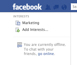
Facebook left menu - Facebook Interest ListYou may have an Interests section on the lefthand menu of your Facebook homepage; if so, click on “Add Interests”.


If not, the easiest way to add the Interests section is to click in the white box at the top of the page that says “Search for people, places and things” and enter the name of a page that you would like to add to an interest list. Once you are on that Facebook page, click on the drop-down arrow beside “”Message” and select “Add to Interest Lists” (see below). Then click “+ New List…”

Later, once you’ve created Interest lists, this is one way that you can add additional pages to the list.


Facebook Interests

A box will pop up; click on “Pages” on the lefthand side. Then start scrolling through the list of pages that you like and click on each page that you want to add to the list – a check mark will appear on each page that you have selected. Click “Next”, then add a name for the list and select who can see the list (public, friends or just you). Click “Done” and you are finished!

Now go to your Facebook homepage (click the Facebook icon on the upper lefthand corner) and on the lefthand menu you will see “Interests” with your newly created list. Click on the list to view updates from only the pages within the list, instead of your entire newsfeed.

To add a new Interest list, click on “Add Interests” on the lefthand menu and then follow one of the suggested lists, search for a list by keyword, or create a new list of your own.

And there you have it – how to organize the Facebook pages you follow using the Interest list.

[divider_line]

Click here to add my “Marketing Pages to Follow” Interest list. And if you have your own Interest list, feel free to post it in the comments section.

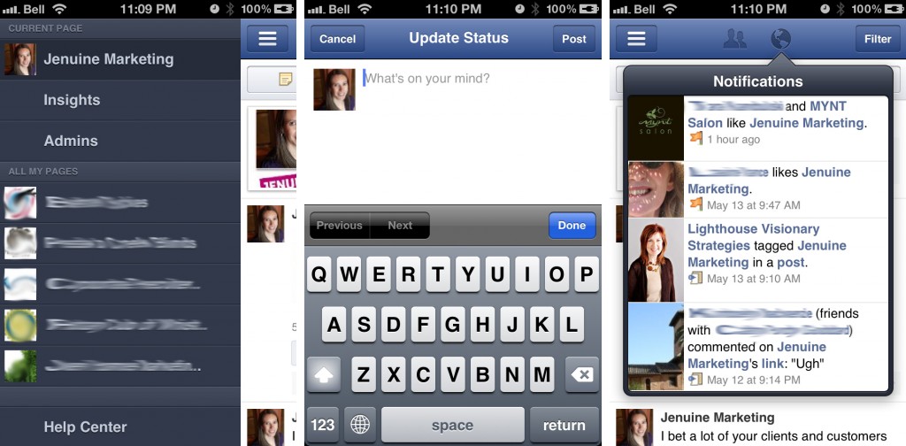
Have you tried out the new Facebook Pages app? For anyone who manages at least one Facebook page, this is a great addition, and even better for those of us who manage multiple pages. But it does have its limitations…

So what can you actually do with this app? Well, you can:

  • View page posts and filter them to show either only the page’s posts, or everyone’s posts
  • Like and comment on the page’s posts
  • Write a new post or share a photo
  • View a list of the people and pages who like the page
  • See new notifications
  • View a list of admins associated with the page
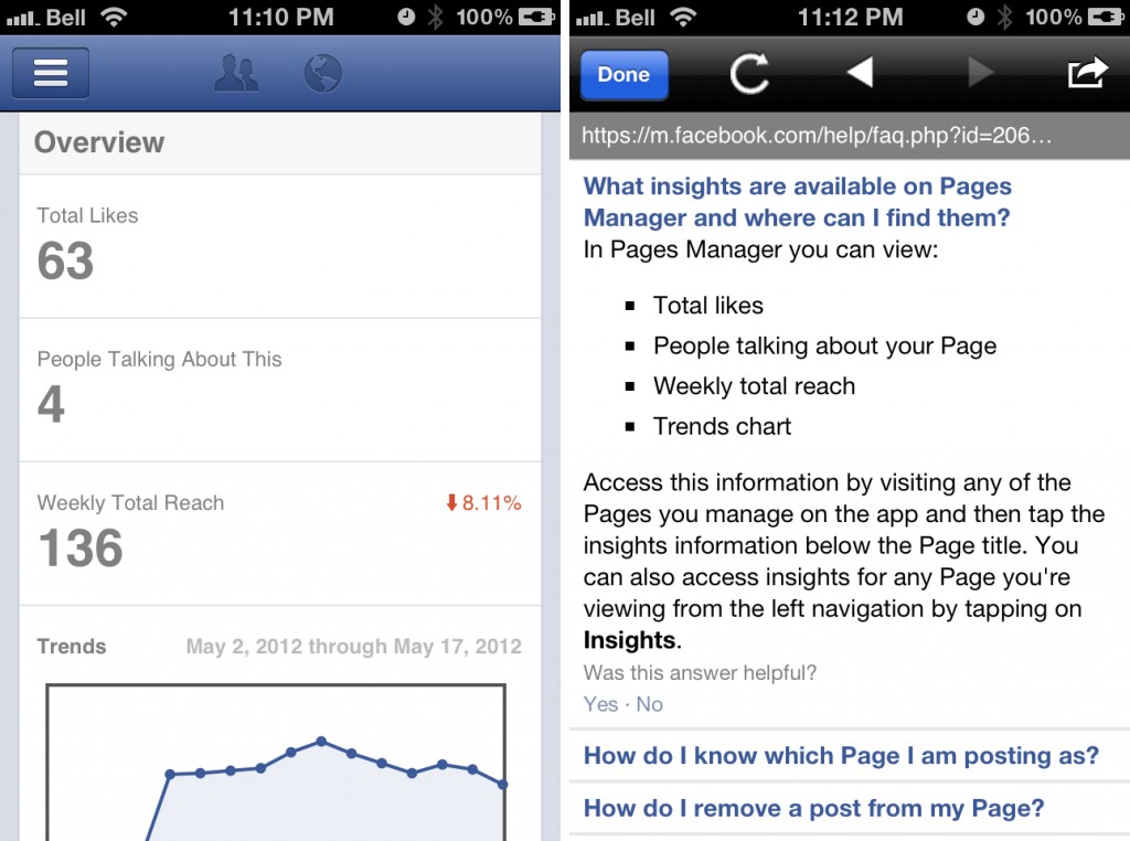
  • And the most important thing is the ability to view a simplified insights overview for the page

And the limitations?

  •  Much of what you can do with this app, you can also do on the regular Facebook mobile app (provided you have set up your page correctly), such as writing new posts, sharing photos and liking and commenting on posts
  • While you are able to view a list of page admins, you can’t change their authorizations or add or delete admins. Clicking on an individual admin simply takes you to their Facebook profile on the main Facebook app
  • The insights provided are very simple compared to the advanced insights available on the web version

So what do you think of the new Facebook pages app?

Book cover - "Ogilvy on Advertising"

Book cover - "Ogilvy on Advertising"

Somewhere along my path to becoming a marketing consultant, an advertising executive gave me his copy of David Ogilvy’s “Ogilvy on Advertising”. Originally published in 1983, it was written well before the boom of online marketing and social media; however, Ogilvy was one smart cookie and his advice still rings true.

The first chapter alone has so many good nuggets of advice:

1. Do your homework
I know, no one likes doing research. But as Ogilvy puts it, “You don’t stand a tinker’s chance of producing successful advertising unless you start by doing your homework“. And this means studying the product, determining what kind of advertising your competitors have been doing (and with what level of success), and finally researching the consumers to find out what they think about the product, what language they use when they talk about it, and what promise would be most likely to make them buy the brand that you are marketing.

Lucky for us, the internet makes research quick, easy and inexpensive:
[blockquote align=”right” cite=”David Ogilvy”]You don’t stand a tinker’s chance of producing successful advertising unless you start by doing your homework.[/blockquote]

  • You can easily study the product and industry by a quick Google search
  • Determine related keywords by using Google AdWords: Keyword Tool
  • Set up Google Alerts to monitor new stories and blog posts about keywords related to your product and industry
  • Visit competitor websites, Facebook pages, Twitter feeds, blogs, etc. to learn about what your competitors are doing and how well they are engaging consumers
  • Use free services such as the “@ Connect” and search options on Twitter, the online application TweetDeck, or else a paid tool, of which there are many, to monitor conversations about your company and industry

2. Brand image
Ogilvy discusses the need to decide on an “image” for the brand your are marketing, and he defines image as “personality”. He tends to use a lot of cigarette and alcohol companies as examples (hey, it was the ’80’s), and talks about Jack Daniel’s whiskey to illustrate the idea of brand image/personality. As he puts it, most people don’t try different types of whiskey and then choose their favourite based on taste alone – they choose their favourite brand based on the image that most appeals to them.

So think about your favourite brands – what images do they project? Do Coke and Mountain Dew appeal to the same audience? What about Nike and lululemon?

Then decide what image should be associated with your  brand (or define it, if it already exists). And make sure that the brand’s personality is consistent across all channels, including print advertising, online advertising, social media marketing, email signatures, voice mail messages, etc.

3. The positively good
“If you and your competitors all make excellent products, don’t try to imply that your product is better. Just say what’s good about your product – and do a clearer, more honest, more informative job of it“. In today’s crowded marketplace, this is extremely sage advice. Since you already did your homework and know what your competitors are saying (see number 1), go out there and do a better job than they do.

4. The lessons of direct response
One lesson in particular stands out to me as being relevant to online marketing. Ogilvy points out that most advertisers like to broadcast their commercials during prime time, but direct response advertisers have learned that they make more sales at night. Take a quick poll amongst your friends (or look at the time of their Facebook updates) and you’ll discover that a lot of people are online late at night and on the weekends. That might be a good time to update your Facebook page or publish a new blog post. Or perhaps your target audience are businesses, in which case you may want to experiment with sending your e-newsletter early in the morning, mid-week. There are lots of online resources out there that show when people tend to be online, so do some research. And remember to experiment by changing the day and time that you share online messaging – you may discover a pattern that is unique to your own company or brand.

And there you have it, online marketing lessons from Ogilvy. For someone who was born in 1911 and died in 1999, it’s amazing how his insights are still applicable. I only wonder what he would have thought about today’s marketing landscape?

Keeping up with social media networks, researching marketing best practices and pouring through content takes a lot of time. But it’s also enjoyable (for me, at least) and easily accomplished. The rest of my business tasks, as well as personal tasks, however, require a bit more planning and structure, a.k.a. lists.

I’ve always been a fan of lists. I have grocery lists, travel packing lists, client lists. And also the dreaded to-do list. Years ago, my to-do lists consisted of scribbles on anything I could get my hands on, from scraps of papers to old envelopes. But as my work evolved and I took on more responsibilities, the time eventually came for my lists to get a bit more sophisticated.

Enter my beautiful to-do book, which is the perfect size to fit in every bag I own. I even wrote my favourite organization quote on the inside for inspiration: “Deal with difficult tasks while they are easy; act on large issues while they are small.”

Recently, I read the book “Organizing Your Day: Time Management Techniques That Will Work for You” by Marsha Sims and Sandra Felton (who also has the amazingly inspiring website, Messies Anonymous). In the book, the authors suggest making your to-do list more powerful by separating it into sections. So now each time I start a new to-do list page, I begin by dividing each page into four quadrants: Go, Do, Buy and Contact.

[blockquote align=”right” cite=”Lao Tzu”]Deal with difficult tasks while they are easy; act on large issues while they are small.[/blockquote]

“Go” means places that I need to go, such as the post office, bank, coffee shop. “Do” refers to things I need to accomplish, such as filing papers or writing a blog post. “Buy” means exactly that, things I need to buy, which may include stamps, office supplies or dog food. The book originally listed “Call” as the fourth quadrant, but for me, “Contact” is a better heading as I may need to call, email, Facebook message, or text someone.

I love this new system, because it gives some order to my tasks and forces me to be a bit more thoughtful when I write something in my book.

How do you stay on top of your to-do items? Does it need revising?

We all love Facebook. It is where we post our pictures, spy on our friends’ lives, send messages, and respond to events. But there is also a lot of discontent with Facebook, for many reasons, one of which is the constant updates and changes to the way Facebook looks and operates.

Facebook CartoonThe newest proposed change (see, sometimes Facebook gives advance notice!) is the roll-out of the “timeline” layout for pages, with March 30th scheduled as the day when it all goes down.

The two most important things for businesses:

  1. The custom welcome landing tabs will no longer have the same impact, as users will automatically be taken to the timeline page. Viewing the welcome tab will require users to actually locate and click on the tab.
  2. Time to make another Photoshop image – the suggested size for Facebook cover photos is 850px wide by 315px high.

Are you excited about the change? Have you already switched your business pages over to the timeline view?